The Dyrt Spot Illustrations
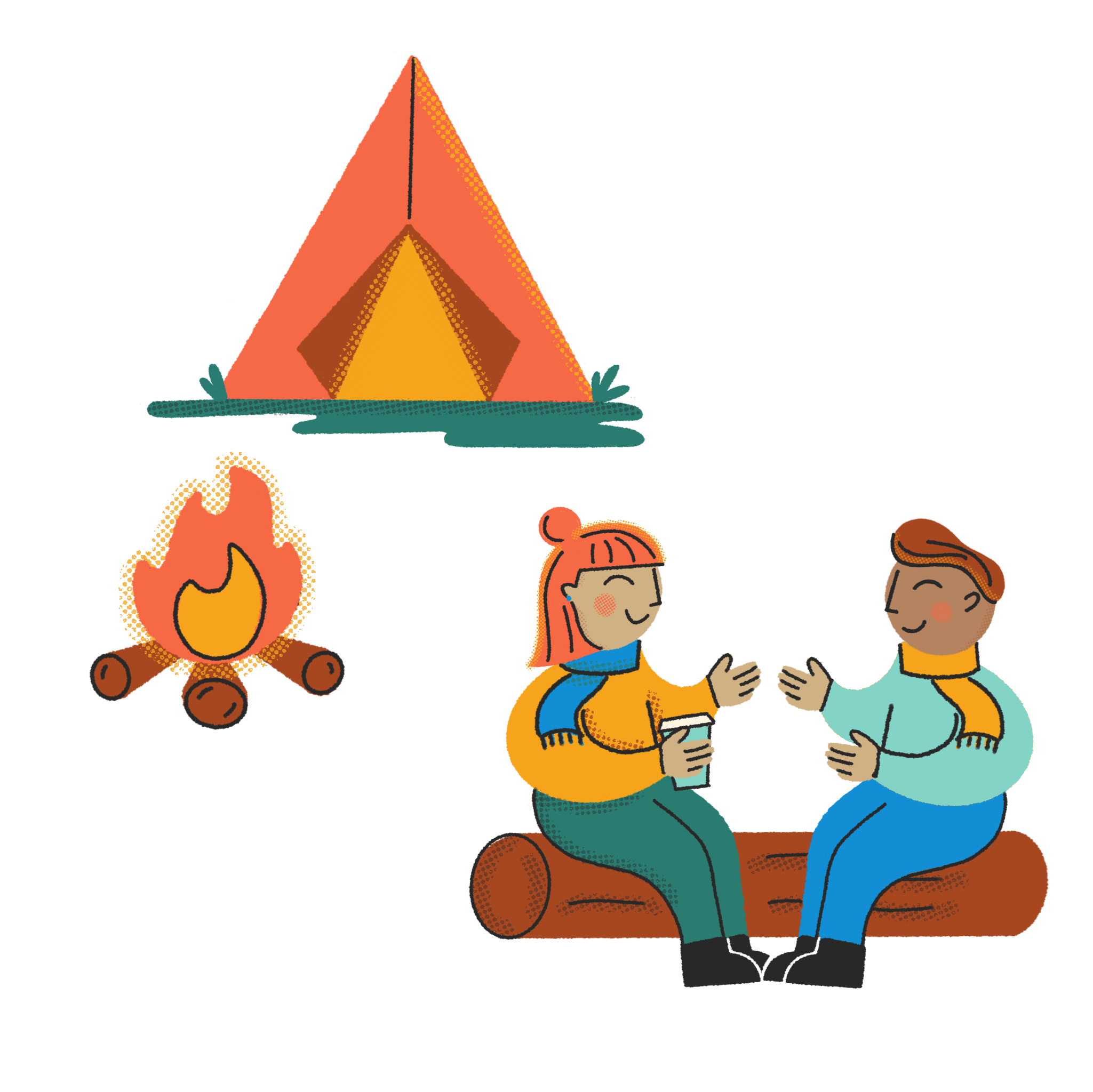
While at The Dyrt, our team decided the platform needed “moments of joy” in the form of whimsical but simple spot illustrations intentionally scattered throughout the user experience.
During their rebrand, both the product and marketing team assessed the brand persona - the tone of the The Dyrt, the “character” the brand embodied, and who they were speaking to.
Because the brand spoke to old school campers or more modern “glampers”, we decided that the illustration direction needed to feel whimsical but very easy to digest/connect with.
Role Design, Art Direction, Illustration
Client The Dyrt

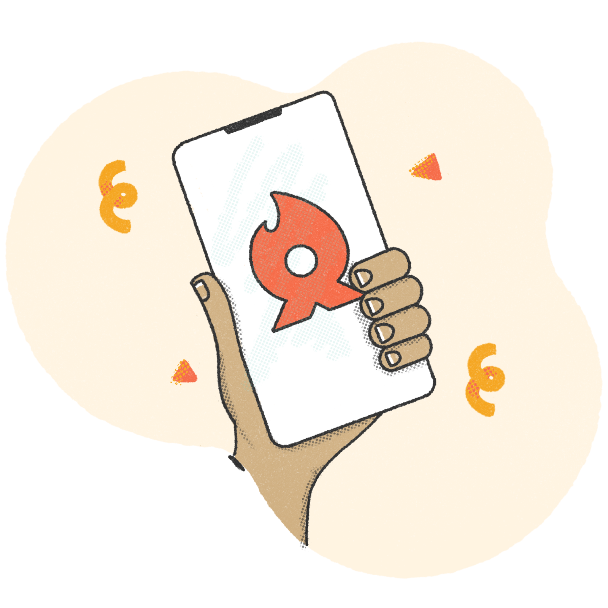
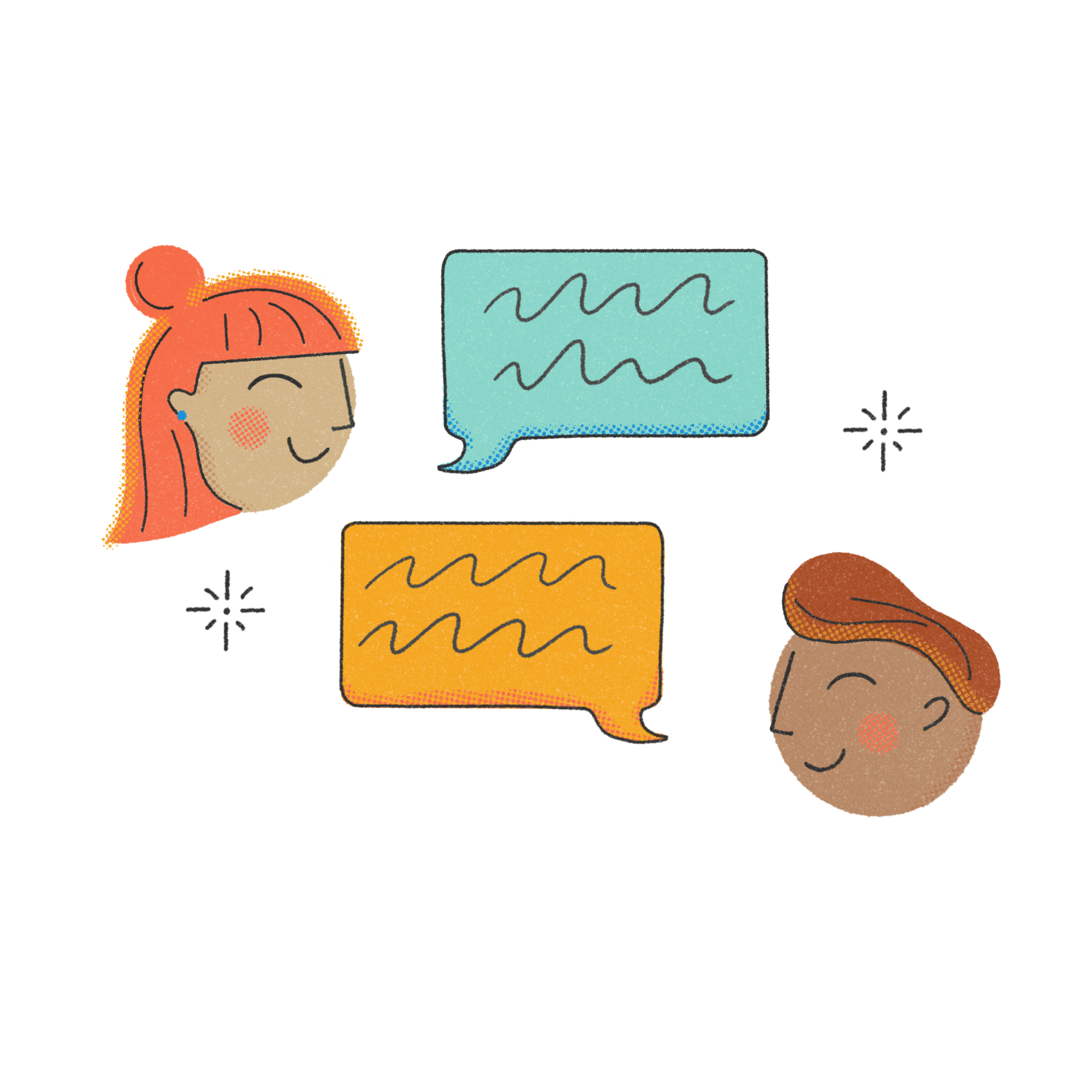
Representation
We wanted to include non-white characters while also avoiding the “tech illustration” trend of making people unrealistic colors/shapes. The goal was for people to look enough like a cartoon to feel inclusive of everyone without going into too much of an unrealistic space with styling.

Color Selection
Colors needed to be able to sit on both light and dark backgrounds. We created abstract shapes as a container for instances where this became an issue.

Brand Voice
At this point, The Dyrt had established the way the mood and voice they wanted their rebrand to capture. Words like "friendly" and "welcoming" were tossed around quite a bit. I kept these in mind as I started developing rules around each design direction established.
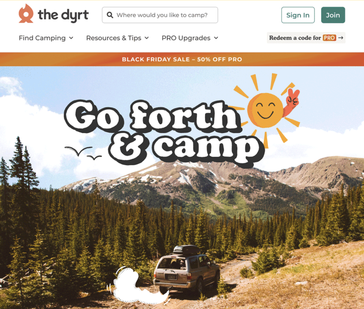
Make Camping Cute -
Make Camping Cute -