
The Dyrt Icon System
When The Dyrt, a camping app/community built on reviews, started their brand redesign, one of my roles was establishing an iconography system based on brand voice, visual hierarchy, and use across the platform.

To start this process, I had to take inventory of the old icon system and where they were used across the app/desktop webpages. The brand hadn't done a full evaluation of all the icon design styles used across their system and had focused primarily on establishing style for active/inactive states.
Role Design and Art Direction
Client The Dyrt

Taking Inventory
I began the process by reviewing all uses of iconography across their product. I also spoke with the previous designer to get an idea of why the different styles were chosen for each placement. Often this was dependent upon size/importance. I made note of this reasoning as well as any future use cases for additional icons.

Researching
I spent a lot of time looking through other product design inspiration and the hierarchy of other brand's icon systems. The icons were designed on a 24 by 24 px grid. I was able to pull some guides from resources online as a starting place.

Brand Voice
At this point, The Dyrt had established the way the mood and voice they wanted their rebrand to capture. Words like "friendly" and "welcoming" were tossed around quite a bit. I kept these in mind as I started developing rules around each design direction established.
Icon System Development
There would end up being about 5 different primary uses for iconography on The Dyrt's platform. A big concern when going through this process was making sure that the user could distinguish between icons that were encouraging an action (clickable) vs icons used to visually ground a menu item or feature.

Rules
I decided that most of the corners in this system would be rounded. Once designed they felt friendlier and in some ways more childlike. In context with the product it contributed to a warm and inviting tone the brand wanted to portray.

Hierarchy
With each level of interest or heirarchy, the icons would have a little more detail. The general rule I tried to keep to was keeping the stroke on the inside of the shape, so it would sit within a whole pixel versus split between two. Though we used .svgs this would help the icon maintain its message if ever exported as a png or jpeg.
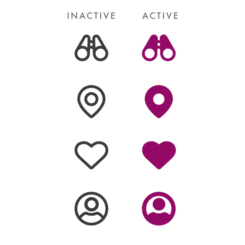
States
Designing for some of the app's menu icons required keeping an active state in mind. It was surprisingly difficult at times. I'd design a monoline icon then try to create a filled version and it wouldn't work. I feel proud of the final product.

Action
We ended up deciding that icons denoting an action would both be filled and have their brand's neutral color as a background. We found that adding a fill wasn't enough to distinguish them as a having a different purpose.
Final System
Final System

General Actions - Icons denoting action

Feature Icons - Icons used on the campground pages to communicate amenities

Site Type - Icons communicating the type of campground (ex: RV, pull-behind trailers, hammock camping, etc)

Access Type - We established this level to show how one would gain access to the campground (hike-in, park and walk, drive-in) and it ended up expanding to the icon level just below spot illustration. These are used when we're wanting to communicate with a bit more detail without adding color. We used two line weights in order to add a bit more detail.